My main reason for doing this brief was to really focus on type as image. It is something I wanted to do in the previous module where I wrote the ‘lyrics and type’ brief, which I ended up terminating and I originally stated that I would take it up again for this module but as time went by, I realised there wasn’t really a context for it. For that reason, I wrote the Best Picture Drive-in Season brief so that I could produce film posters, working with quotes from the film to incorporate type as image.
I feel the quality of the posters is my main strength here; not specifically in terms of printing but more in terms of image quality. Also, similar to the puffin books - they all look different but by sticking to certain design constraints, they all work as a set.
My weakness is probably the actual copy type on some of the leaflets and promotional pieces. This aspect of type is something I don’t really work with very much and its not something I would say I am particularly skilled in.

Roald Dahl Collection evaluation
This is possibly my favourite brief from this module because I was working for a target audience that I hadn’t worked for before and working to a context that I hadn’t worked for before, so it was 2 new things that I happened to really enjoy so it highlighted something that I will want to work on in the future.
My main strength in this brief, I believe, is the illustration aspect. All the covers are different but by sticking to handcrafted illustration, they all work as a set.
The weakness for this brief, and I believe it is a weakness for most of the briefs is the photography of my own work. I enjoy photography in terms of outdoor photography, music events, architecture etc. but when it comes to using it as a tool to document my work, I sometimes felt the photos didn’t do them justice sometimes - admittedly in some instances it may have made the work look better but on the whole, I don’t feel it was a strength of mine.
Booklet mock up 2
This one is A5 - and the size is a lot more manageable/realistic.
However there are 2 problems with this one;
1. I'm not completely sold on the cover, I like all the stationary pieces but I don't think the title stands out enough.
2. The pages don't line up - ones a little lower/higher than the other, which is annoying and is too obvious to ignore.


However there are 2 problems with this one;
1. I'm not completely sold on the cover, I like all the stationary pieces but I don't think the title stands out enough.
2. The pages don't line up - ones a little lower/higher than the other, which is annoying and is too obvious to ignore.


Booklet covers
In addition to the A4 one being a little too big - I felt it was also missing a cover, so I produced the one below - not only does it give it colour, it showcases the seperate pieces of stationary and add's another 'to be coloured' page. It looks quite fun!

The variations below probably don't look any different at first glance, but they actually incorporate the title 'handcrafted'.


The variations below probably don't look any different at first glance, but they actually incorporate the title 'handcrafted'.


Booklet mock up 1
I printed it off first as an A4 booklet because I was concerned that if it was any smaller, you may not be able to see the detail of each letterform clear enough - but on reflection, I think it might actually be a little too big.


'Handcrafted' booklet
As I wanted to showcase the letters more - I chose to make it into a booklet.
Its simple (could be used as a colouring book?) and showcases each letter as I wanted it to. So it does I wanted it to do.
Its simple (could be used as a colouring book?) and showcases each letter as I wanted it to. So it does I wanted it to do.
Poster compositions
As the product as the end of this brief is a basic typeface (26 letterforms) - I wasn't sure how to display them, so I tried out a few compositions.
Although this worked in terms of showing all the letterforms, I'm concerned that it doesn't show the individual pieces of stationary clear enough - obviously its not going to be totally clear when they're really small, but as an initial impact poster - I think it needs to be made clearer.


Although this worked in terms of showing all the letterforms, I'm concerned that it doesn't show the individual pieces of stationary clear enough - obviously its not going to be totally clear when they're really small, but as an initial impact poster - I think it needs to be made clearer.


These layouts work a lot better in terms of emphasizing one letterform and showing the content of each letter/the stationary, but I think as a product for the brief, I want to showcase each letterform more clearly.


Letterforms initial layouts
I chose to base the typeface on Helvetica Neue Bold - the letterforms are bold and clear, meaning that hopefully when its complete - the letterforms will be readable and work/read as a sentence/word when they're put together.
Handcrafted typeface - stationary
After some sort, I decided to product a typeface based on an existing one - but using illustrations of the tools that may be used by some of the artists to produce the handcrafted work.
Also, it gives me the oppurtunity to draw stationary - something I'm a fan of anyway!


Also, it gives me the oppurtunity to draw stationary - something I'm a fan of anyway!


Handcrafted type - brief
When it came to making my context book, I didn't want to just use a computer generated font on each postcard - especially when the publication is titled 'Handcrafted', but I did want there to be some correlation between them all - so I decided to write a short brief where I produced a typeface to be used in the publication.


Drive-in context mock ups


(The image used below from the Leeds Tourist Info Centre is actually thanks to Leigh, I found it on her blog and asked permission to use it - so thankyou again Leigh.)


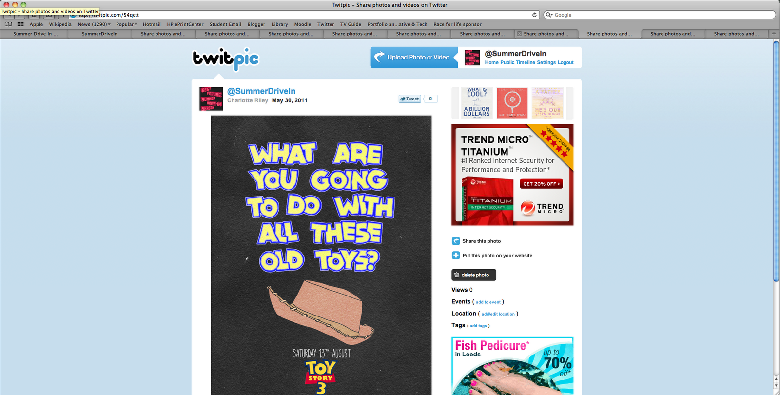
Drive-in twitter page
I thought it was a good promotional tool to set up a twitter page - seen as everyone and everything seems to be on twitter, and its a good tool to promote each film AND another place to show the posters for each film.
I was just going to mock up a twitter page, but it actually turned out to be easier to actually set one up. The page is @summerdrivein
I'll delete the page soon.


I was just going to mock up a twitter page, but it actually turned out to be easier to actually set one up. The page is @summerdrivein
I'll delete the page soon.


Oscar prints
I'm really happy with how the prints turned out - especially the quality.
The one problem was with the event banner - for some reason, it seems like it was dragged out of the printer at the bottom (which it wasn't) because the logo's at the bottom are blurred.
Also - I stupidly forgot to take the A scale poster - so I only printed out the banner at a larger scale.


The one problem was with the event banner - for some reason, it seems like it was dragged out of the printer at the bottom (which it wasn't) because the logo's at the bottom are blurred.
Also - I stupidly forgot to take the A scale poster - so I only printed out the banner at a larger scale.


Subscribe to:
Comments (Atom)