


NYC - Airport promo
This NYC promotional installation has given me some ideas of another form of promotion for the Gay pride march - as it could be promoted in UK airports (that fly to NYC) and then in the New York airports on arrival - this would be a temporary installation for about a month before the event.

 Flyers for the event could then be handed out on te plane or in the on board magazine - flights from UK to US or flights from state to state.


 Flyers for the event could then be handed out on te plane or in the on board magazine - flights from UK to US or flights from state to state.
NYC pop up's 3
The previous pop up ideas work well, but when people open an invitation or a card - it is usually portrait and the previous designs only work when it is opened upwards, landscape. Therefore I wanted to look at how I could make something pop up in a portrait fold.


2.


3.


4.


1.


1. This mock up was just to see how the 'flaps' needs to be positioned for it to actually stand up and fold well.
2.


2. This is using exactly the same techinque as the one above but I tried cutting letters out and a 'pattern' to stand in front...I soon realised that 1) the card would need to be a lot more sturdy to hold up the 'pattern' at the front and letters need to be joined to make it stand up as, on this one, the N and the C don't have anything supporting them.
3.


3. Having learnt that the letters needed to be connected, I worked with a slightly larger piece to stand up and connected all the rough letters - I feel it worked well.
4.


4. I took the previous idea slightly further and added a rough skyline in the background and as a rough tryout, I am really happy with it! I think when more care is taken over the type, illustration and construction it could work really well.
NYC pop up's 2
As I mentioned in the previous post, I was worried that the initial ideas may have been a little simple but after some thought, I realise that it would probably be quite simple to make it look more complex.


2.


3.


1.


1. This was done in pretty much the same technique as the type in the previous post, but by having 3 levels it looks a more 'complex'.
2.


2. It was relatively simple to put designs onto these 'steps' and it gives a nice composition and the oppurtunity to work with scale etc. and as mentioned, it looks more complex.
3.


3. The idea behind this was to try and make it look like skyscrapers at different heights - evidently, it didn't work! It just looks...messy. Hence, this is something I won't be developing.
NYC pop up's 1
Before I could really start designing for actual pop ups...I needed to know how to use them.
I haven't looked at particularly difficult pop up techiniques, I just wanted to work with relatively basic ones so that the focus would be on the design/graphics, as opposed to really complicated pop up construction.


3.


4.


I haven't looked at particularly difficult pop up techiniques, I just wanted to work with relatively basic ones so that the focus would be on the design/graphics, as opposed to really complicated pop up construction.
1.


1. The first thing I learnt from this was to not fold the paper before cutting - as it just puts a fold through the lettering.
2.


2. The actual lettering on this one worked better than I expected - but as the first image shows, when its folded, the letters come higher than the un-cut paper, so it 'sticks out' - this would need to be addressed.
3.


3. Same problem as before, I made the pop out deeper and it once again came above the un-cut paper. Also, the 'D' in 'pride' wasn't attached to anything so it wouldn't have stood up if I didn't keep it slightly attached to the 'I' but it looks bad!
4.


4. I managed to overcome the 'when folded it comes higher than the un-cut paper' issue by getting my measurements right.
These work fine, but they may be a little simple...
These work fine, but they may be a little simple...
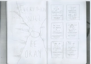
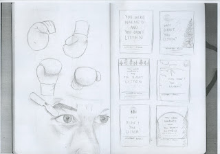
Oscar brief initial ideas/sketches
I've finally grown to like my moleskin...I think I resented it at first because of the price and thin pages because I bought the wrong one!
So, I have been using it more and its a nice size to get ideas down without being feeling under pressure to fill an A4 page!
So, I have been using it more and its a nice size to get ideas down without being feeling under pressure to fill an A4 page!
Black Swan;

The Social Network;
 The Social Network/The Kings Speech;
 The King's Speech/127 hours;
 127 Hours/The Fighter;
 The Fighter/Winter's Bone;
 Inception;

The Kid's are alright;
 Toy Story 3;
 Toy Story 3;
 True Grit;
 True Grit;


The Social Network;
 The Social Network/The Kings Speech;
 The King's Speech/127 hours;
 127 Hours/The Fighter;
 The Fighter/Winter's Bone;
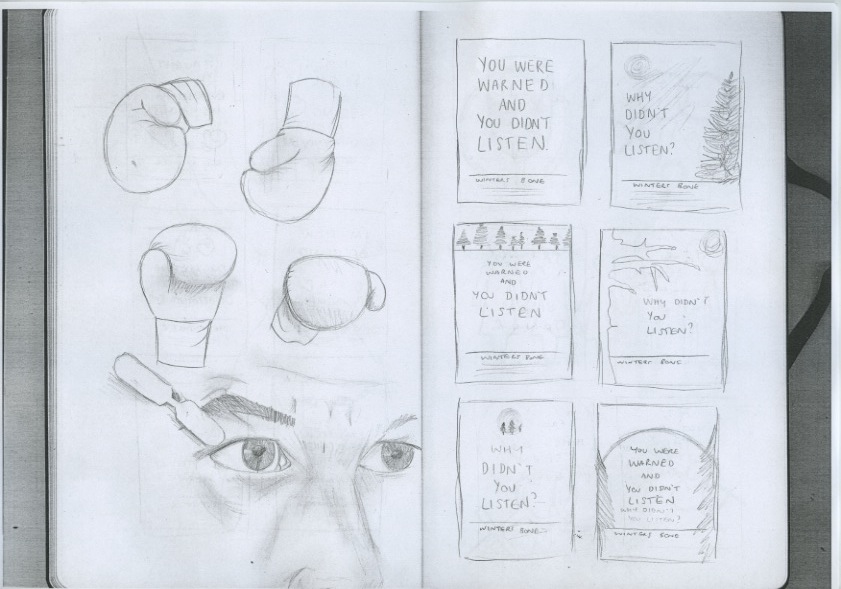 Inception;
The Kid's are alright;
 Toy Story 3;
 Toy Story 3;
 True Grit;
 True Grit;
Subscribe to:
Posts (Atom)