‘Investigation of hand-crafted type and image’
Chapters/Categories:
Type and illustration for food/drink packaging.
- Examples of packaging.
- Materials.
- Printing processes.
- Colour selection.
- Historical/Past examples.
- Designers that do it well - Case studies.
- Quotes.
Children’s book cover illustration.
- Examples of contemporary children’s book covers.
- Well known illustrators/image makers - Case studies.
- History of children’s books.
- Tips i.e. Author as a brand.
- Brands/Brand guidelines.
- Print processes.
- Quotes
Black and white illustration.
- Why choose black and white illustration?
- What makes black and white illustration successful?
- Printing?
- Examples of work
- Appropriate contexts for it.
- Successful illustrators who do it - Case studies.
- Quotes.
Papercraft.
- What is papercraft?
- Techniques/How to?
- Examples of work.
- Appropriate contexts.
- Price restrictions.
- Mass production/printing processes.
- Materials.
- Successful papercraft designers - Case studies.
- Quotes.
Hand rendered type.
- What is hand rendered type?
- Examples of work.
- Appropriate contexts for hand rendered type.
- Top hand-rendered type designers - Case studies.
- Why choose hand-rendered type?
- Quotes.

Publication Formats
I had decided quite earlier on that I didn't really want to produce a basic book; this isn't because I think there is anything wrong with it, I just wanted something a little more interactive to reflect my design practice. This led me on to thinking about what format's could be appropriate for the context brief...
The work below by Shrigley, Hunter, King and Electric Angel are pieces that I have referenced in a previous brief (from the second year) because although they are collections of postcards, I still think they work well as books as they could just be treated like loose pages; also Lizzie Hunter's piece is actually a book of postcards with perforated edges so they can be removed.
David Shrigley;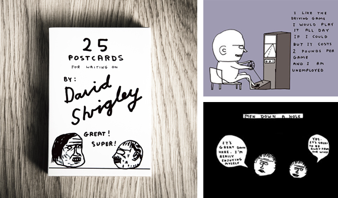

Lizzie Hunter;


Scott King;

Electric Angel;

This piece by Christopher Seeds is a nice example of how a long strip could work/read as a book but fold out into something more. If I was to produce something like this, I would be more likely to make it as a fold out poster.
Christopher Seeds;


A5 Magazine Portfolio;

Although the style of work on this Clare Ultimo piece doesn't exactly reflect my design practice, the format is interesting and something worth exploring - It is a way of including a lot of information but in different formats and scales, all kept in one package.
Clare Ultimo (Broadway Interactive Kit);
This book collection below (not sure who its designed by) is an interesting examples of how, what seem to look like quite basic books, can be interactive and sophisticated with pull out tabs and loose leafs to take out etc. and then how they can be packaged together.

Jordan Metcalf
In the process of looking for specifically black and white illustrations, I found this piece by Jordan Metcalf.
Metcalf preferred his b/w version but the t-shirt company he produced it for wanted him to add colour to it.
I think it works perfectly well just as a b/w illustration but I can see why colour may be needed for it to work on a t-shirt - to make it stand out more.

Metcalf preferred his b/w version but the t-shirt company he produced it for wanted him to add colour to it.
I think it works perfectly well just as a b/w illustration but I can see why colour may be needed for it to work on a t-shirt - to make it stand out more.

T M Addison
I love these typographic pieces by Addison.
The first one, 'I gots a lotta hair' is great because its so simple, its clearly based around Cooper Std (or something unbelievable similar) but by adding the finely detailed 'hairs' to it, it gives a flat illustration texture - it makes it look like it Should feel fluffy/hairy.

This 'sick' piece doesn't appear to be based on an existing typeface, therefore a lot more hand crafted. The highlighted areas to show the flow of the lettering works really well and really like the end resuly.

Nikita Milukovs
These detailed, fine illustrations by Milukovs are beautiful.
Although I like the illustrations as a whole, the main aspect of them that I like are the intricate patterns used to create textures on the various objects that have been drawn, for example the first image below: the bird, instead of drawing tiny little feathers, its a collection of line patterns which works just as well and gives it a more personal style.


Although I like the illustrations as a whole, the main aspect of them that I like are the intricate patterns used to create textures on the various objects that have been drawn, for example the first image below: the bird, instead of drawing tiny little feathers, its a collection of line patterns which works just as well and gives it a more personal style.


Johanna Basford
I have been aware of these illustrations for some time, as I saw them at the Edinburgh fringe last year but I didn't know who had done it and I came across it again on behance.
On the first 2 images below, the composition is particularly interesting and it allows the illustration to work across a variety of scales and formats. In my opinion, I think adding colour to the actual illustration would somewhat ruin it - the fine detail is enough to catch the eye.


On the first 2 images below, the composition is particularly interesting and it allows the illustration to work across a variety of scales and formats. In my opinion, I think adding colour to the actual illustration would somewhat ruin it - the fine detail is enough to catch the eye.

The type as image piece that she has then created using her equally detailed illustrations, is beautiful. From a distance, it is clearly readable and the closer you get, the more time you would spend looking at it because of all the imagery inside the lettering - in my opinion it works just aswell in terms of readability as the solid vector type.

Jeff Finley
Branding/Logo's isn't something I really focus on, but when I came across these black and white band logo's by Jeff Finley, I was instantly drawn to them...but in fairness, they are mainly type as image based.
The fact that the designer has designed them in black and white, in my opinion means they have more longevity because, although they all work as 1 colour designs, they can always be changed by simply adding colour or using different print techniques/finishes depending on the context i.e. t-shirts.


The fact that the designer has designed them in black and white, in my opinion means they have more longevity because, although they all work as 1 colour designs, they can always be changed by simply adding colour or using different print techniques/finishes depending on the context i.e. t-shirts.


Iain Macarthur
Everytime I looked at a new image produced by Iain Macarthur it shocked me even more - by taking things like birds, bears and skulls that are drawn quite a lot and adding his own textures that actually remind me a little bit of japanese tattoos.
The patterns that he uses to create textures on the animals/objects make them much more visually engaging.
They are a perfect example of how beautiful black and white imagery can be - if these had colour, it would risk overpowering the fine details and it really doesn't need any colour to attract any attention.


Diogo Machado
Although I like these illustrations by Machado, they don't have a particularly strong link to my design practice however, it is the line quality that I take more inspiration from here.
By using different line weights, it highlights different things and gives it a tonal value.


By using different line weights, it highlights different things and gives it a tonal value.


Andreas Preis
I absolutely love these images by Andreas Preis. I like working with lines anyway, but it is interesting to see how Preis has used the lines to create different shades - from a distance it looks like he has different shades of grey, but when you look closely, it appears that the different tone are created by the lines and how the thick the lines are and how spaced apart they are i.e. if they are very close, from a distance, it looks almost black and if they are quite spaced out they look like a light grey. Its a great idea of how using one colour, you can still create different tones.


Book Cover printing
More specialist techniques for certain book covers:
Embossing (i.e. Goosebumps books)
Embossing refers to the creation of an impression of some kind of design, decoration, lettering or pattern on another surface like paper, cloth, metal and even leather, to make a relief. In regular printing or an engraving, plates are pressed against the surface to leave an imprint. In embossing however, the pressing raises the surfaces adding a new dimension to the object.
Embossing is an elegant process that changes the nature of the material that has been embossed. More often than not it elevates the standard and quality of the product. A notary’s embossed seal can give much weight to a regular piece of paper. Similarly, an embossed wedding card immediately changes the entire meaning conveyed by the invitation. The recipient is informed not only about the wedding but also that it is going to be a high profile wedding and an elegant ceremony.
Embossing thus makes things more beautiful than they originally are. The simplest of object can become pieces of art worthy of the highest praise by using a technique as easy as embossing. Of course, how good an embossed object looks depends entirely on the quality of embossing. Poor quality embossing can completely kill the appeal of an object. However, good quality embossing can make an object positively breathtaking.
Embossing involves the creation of an impression by placing the dies in contact with the stock under high pressure. Different kinds of paper show different kinds of embossed effects. There are also many different kinds of embossing that can be done like blind embossing, tint embossing and glazing to achieve different results. The process of embossing is relatively inexpensive and has many uses.
Embossing is used for aesthetic purposes as well as functional uses in industries. From embossing names on credit cards to embossed Braille books for the blind, embossing has a wide range of applications and uses.
Thus, embossing is a technique that adds elegance and sensuality to any paper or surface.
Process
The process of embossing is extremely simple and cost effective. It is one of the cheapest ways to enhance the look and feel of any surface be it paper, cloth or metal even. There are several things that need to be attended to in an embossing project. The metal dies to be used, the surface to be used, the creation of the artwork and the embossing details of course.
Types Of Metal Embossing Dies
There are three types of metals that are used for embossing dies. Depending on the shape of the image, the texture to be created and the length of the run you can select the metal.
• Magnesium dies are used for easy embossing projects that have short runs. The designs are large and uncomplicated. Magnesium also allows for special hand tooling.
• Brass dies are the most popular embossing dies. They are very flexible and give the embosser leeway to create fine lines, sculptured images, combo foil stamping and embossing. They are also very good for images requiring extensive hand tooling. You can make brass dies by machines or by a semi-photographic process. The photograph is transferred onto the die to use as a guide for drawing.
• Copper dies are used as an in between to magnesium and brass. However copper dies do not permit hand tooling.
Choosing The Right Paper For Embossing
Paper textures play an important role in embossing. Sometimes clients select a texture paper and use embossing to smooth out the paper where it is least expected. At other time a smooth paper is used but the emboss is textured for a stunning finish.
Heavy, long fibered sheets make the best kind of paper for embossing. Lightweight, heavy coated or varnished papers are not good for embossing because they crack easily. Also recycled paper is to be avoided for embossing. In general the more processed a paper is the weaker it becomes and cannot withstand the pressures of embossing.
The depth and the degree of bevel achieved are determined by the stock. A thicker stock can offer more dramatic embossing effects because the impression can push deeper into the paper and varying levels of relief become possible.
Preparing The Art Work For Embossing
It is very important to keep the following things in mind when preparing art for embossing.
• Avoid too many fine details and tiny criss cross lines. Keep the design uncluttered and bold.
• When using lettering use sans serif fonts and space them so that there is enough space between each letter to allow for the embossing effect.
• Increase the size of the art slightly to compensate for the added dimension.
• For multi level embossing it is best to use color codes to indicate the various levels.
• Keep the image area at least .25 inches away from the edge of an oversized sheet to avoid puckering or wrinkling. If the embossing is being done on a finished project, keep a .5 margin.
The Processes
There are different types of embossing processes that can be used.
In one type of process, the embossing dies come into contact with the wet pulp or damp paper under high pressure. This creates a raised surface. One way of embossing paper is to place the selected die directly onto a freshly pulled sheet and let the sheet dry on the mould. However, it is far more common and effective to impress an item into the sheet under pressure.
Another method of embossing involves using ready-made paper and running it through a printing press. The paper is dampened and pressed against a block or plate prepared by the embosser. Handmade, machine made and mould made papers all withstand this technique gracefully with fantastic embossing effects.
Thus, embossing is a fairly simple process that takes elegance to new heights.
Uses
Embossing is the process whereby a new dimension is added to any surface, which can be pressed upon. This new raised dimension could be a design, pattern, lettering, logo, seal or anything at all. The surface could be anything on which you can press and leave an impression. Paper is the most popular surface for embossing but cloth, wood, glass, tiles and even terra cotta pots can be embossed upon.
Embossing is an elegant process that adds aesthetic appeal to the object. It also has many functional uses.
Aesthetic / Commercial Uses Of Embossing
• Embossing is commonly used to make paper objects like cards, letter writing paper and envelops, thank you notes, paper gift bags and other kinds of stationery. With just a small-embossed design the paper objects become very appealing and sell for more.
• Embossing is a great method for personalizing gifts like a leather wallet or diary. The name or a message can be embossed on the gift to make the recipient feel extra special.
• Embossed fabrics are very popular with women not only for curtains and cushion covers but also to design fashionable clothing to wear. Velvet evening gowns with an intricate emboss are fit to be work to the Oscars.
Functional / Industrial Uses Of Embossing
• Business cards are probably one of the largest applications of embossing used in the corporate world. Embossed letterheads, cards and office stationery are often used by large corporations to portray a professional and yet elegant look.
• Embossing is also used for the publishing of Braille symbols and books for the blind. This use of embossing alone puts the technique in a class of its own.
• Another popular use of embossing is in credit cards, debit cards, ATM cards and other membership cards and forms of identification. The name and date of birth of the individual are embossed onto the card in just a few minutes to expedite the entire membership process.
• The advertising and marketing industry is also a fan of embossing. It is a popular style used for promotional materials. It is also a popular way to imprint brand names on freebies and giveaways so that the brand name is present in an unobtrusive way.
• Embossing on fabric is also very popular. The textile industry uses embossing for everything from curtains, drapes, cushion covers and bed spreads to shirts, dresses, caps and casual wear as well.
• Embossing is also popularly used on bookbindings of classic leather bound books. In fact between the Civil war and World War I editions of the bible and other valuable books were sold in two versions – the embossed and the unembossed. The former obviously sold for a better price.
Thus, there are many uses of embossing. In fact embossing is a technique that simply requires a surface. You don’t need a reason to emboss something. Just do it to make it look prettier than it already is!
Techniques
Embossing is typically accomplished by applying heat and pressure with male and female dies, usually made of copper or brass, that fit together and squeeze the fibers of the substrate. The combination of pressure and heat raises the level of the image higher than the substrate, while "ironing" it to make it smooth. In printing this is accomplished on a letterpress. The most common machines are the Kluge Letterpress and the Heidelberg Letterpress.
"Debossing" is similar to embossing, but recesses the design rather than raising it.
Most types of paper can be embossed, and size is not normally a consideration. Embossing without ink, so that the image is raised but not colored, is called "blind embossing." Embossing used in conjunction with ink, so that the raised area is colored, is called "color register embossing." Embossing used in conjunction with foil stamping is called "combination stamping" or "combo stamping."
Embossing involves a separate stage in the production process, after any varnishing and laminating. It requires a separate press run, and is priced accordingly. In addition to being used as a design element, embossing can be used to improve the performance of paper products like napkins, diapers, and tissue paper.
Foil blocking
Foil blocking has been developed using the letterpress principle. A male block is produced using zinc, magnesium, copper or brass. These are process engraved.
The block is heated on press and a metallic or coloured foil is branded on to the material. Foiled logos are incorporated into many corporate identities, used especially on corporate invitations, business cards, letter headings and compliment slips.
Foiling & Embossing
Foiling and embossing can be used on the same image, firstly foiled and then embossed. Again logos are incorporated into many corporate identities, used especially on corporate invitations, business cards, letter headings and compliment slips.
A highly cost effective way to add metallic colour to all or part of printed products.
Fully compatible with laser printers.
Ideal for Invitations, business cards, letter headings and compliment slips ect.
We can print to order on any thickness of material.
Ideal for use in conjunction with thermography, embossing and lithography.
Foil stamping, typically a commercial print process, is the application of pigment or metallic foil, often gold or silver , but can also be various patterns or what is known as pastel foil which is a flat opaque color or white special film-backed material, to paper where a heated die is stamped onto the foil, making it adhere to the surface leaving the design of the die on the paper. Foil stamping can be combined with embossing to create a more striking 3D image.
Foil stamping machines, also known as hot foil stampers, use heat to transfer metallic foil to a solid surface. Examples of items that are foil stamped include pencils, napkins, matchbooks, photographs and books. The foil stamp is a permanent process. These machines are popular with wedding businesses, photography studios and other businesses that need to brand or mark products.
A similar machine, called a foil fuser, creates a similar look in a process called foil fusing in which foil is fused to printer toner by means of heat.
Book Printing
(Information on printing whole books - not specifically covers)
Three Ways to Print Books
There are actually three distinct technologies to print books, all of which are widely used. Let’s quickly run them down and see where each comes into play.
1. Letterpress—This was the main printing method from Gutenberg’s day until the middle of the twentieth century. In one way or another, type, pictorial engravings, or etched metal plates made from photographic originals are inked and then paper is rolled over them, transferring the image to the paper, one sheet at a time.
Letterpress technology led to large, automated presses. You can see just how versatile this printing method had become because it overshadowed all other forms of printing for over 400 years. Letterpress is still in use today for very fine limited edition books, and in areas of the world where electricity is unreliable. A letterpress that’s powered by a foot pedal can run for many years with just a lube, and doesn’t need power at all.
2. Offset—Offset printing’s development at the beginning of the twentieth century was sparked by the accidental discovery that an image transferred to paper by a rubber covered cylinder was actually sharper than the image from the original type. This offset image gave rise to the name offset printing. With the advent of industrial uses of photography and advances in paper and platemaking materials, photo-lithography, the making of printing plates through the photographic process, allowed offset printing to overtake letterpress. In sheet-fed offset, paper is fed to the press and printed one sheet at a time. In web offset, special presses are used to print from a large roll of paper which, as it travels through the press, forms the web for which it is named. At the end of the press the paper is cut into individual sheets. Bindery equipment to fold, trim and assemble the printing job is often set up right at the end of the press, allowing the printer to complete a printing project in one pass from blank paper to a finished, assembled job.
3. Digital—Digital printing, the result of marrying a computer-driven high-speed copying machine to computer-driven bindery equipment, is the fastest-growing form of book printing today. Computer servers hold separate but coordinated digital files for the book’s cover and interior text block.
At a request from the operator or a computer instruction, the files are downloaded to the printing end of the press and imaged with toner in the same way your high end copier images copies. The resulting pages are combined with a color-imaged cover. The whole book is glued together and trimmed. Some digital printing equipment can produce an entire book, color cover and all, in just seven minutes. The major difference between letterpress and offset printing, on one hand, and digital, on the other, is that digital printing is designed to create one copy of a book at a time. The other, earlier methods of printing produce books in stages, and only work efficiently when producing many copies at once.
Comparing the Three Printing Methods
Well, now we know about the three printing methods, but how does that help pick the right one? Here’s how each printing method is best used:
• Letterpress printing is used almost exclusively for fine, limited edition books. The characteristic “bite” of the type into the paper, and the resulting subtle texture it adds to the page is impossible with other methods. These books are usually made with lavish materials and can cost hundreds of dollars each.
• Offset printing is used for the majority of books produced today. Web offset is used to make mass market paperbacks, like the ones sold in racks at supermarkets and at airports, and for very large printings of other books. Sheet-fed offset book printing offers the best quality reproduction of artwork and photography, and is the most flexible when it comes to the number of sizes offered for books and the different kinds of paper available for printing.
• Digital printing is increasingly being used in the print-on-demand distribution model that’s becoming so popular. Larger publishers are moving their backlist books to digital printing, saving money on warehousing and shipping. The self-publishing phenomenon has created a huge demand for digital printing through print-on-demand distribution, since it has eliminated almost all of the cost of putting a book into print.
Puffin information
‘Good design is absolutely crucial. A book will only succeed if it looks really good. Children are such sophisticated judges and they are the first to reject a book because of its cover. Format, typeface, blurb and, of course, the cover design play a crucial role in our success. We spend a lot of time talking about how a book should look - as much time as we do thinking about whether we should acquire it in the first place.’ (Francesca Dow, 2009)
‘The Author as brand’
‘The idea of packaging a single author’s works, or a particular set of related titles, in a similar manner to encourage collecting habit, is an old one and can be seen early on in the Puffin list. Today, however, this has been honed to a fine art and is the result of close collaboration between the editorial, marketing and design departments.
While not the first illustrator of Roald Dahl’s children’s stories, Quentin Blake has been illustrating them since 1976, and to many the two seem inextricably linked. For the latest re-branding of Dahl titles, Blake’s existing illustrations have been re-used and reconfigured as necessary to work with the more prominant use of Dahl’s name and the bellyband that contains the title. These are considerably better balanced visually than the previous design with its side bar and box, and make a very effective display en masse in bookshops.’


‘Among very successful visual author brands are the recent covers for Sarah Dessen, in which the image plays a more prominent role. Teenage and girly, bus sophisticated with it - so striking and successful are they that the publisher of some of Dessen’s other books has mimicked the design.’


‘Tove Jansson was also the illustrator of her own books, which gave her Moomin series of books a unity before author branding began to be fully exploited.’


‘Tove Jansson was also the illustrator of her own books, which gave her Moomin series of books a unity before author branding began to be fully exploited.’

Quentin Blake
Quentin Blake is obviously most well known for his Roald Dahl illustrations - when one is mentioned, they are automatically linked with the other.
Blake's illustrations work so well with childrens books because of their somewhat 'messy' line quality and colouring in, which makes them appear quite childlike however, the fact that Blake is so successful means that his technique is widely accepted - so although it may appear quite rough and messy, it is Very well done and if the tecnique was copied, chances are their attempts wouldn't be successful as Quentin Blakes.


Blake's illustrations work so well with childrens books because of their somewhat 'messy' line quality and colouring in, which makes them appear quite childlike however, the fact that Blake is so successful means that his technique is widely accepted - so although it may appear quite rough and messy, it is Very well done and if the tecnique was copied, chances are their attempts wouldn't be successful as Quentin Blakes.


Subscribe to:
Posts (Atom)