
On the first 2 images below, the composition is particularly interesting and it allows the illustration to work across a variety of scales and formats. In my opinion, I think adding colour to the actual illustration would somewhat ruin it - the fine detail is enough to catch the eye.
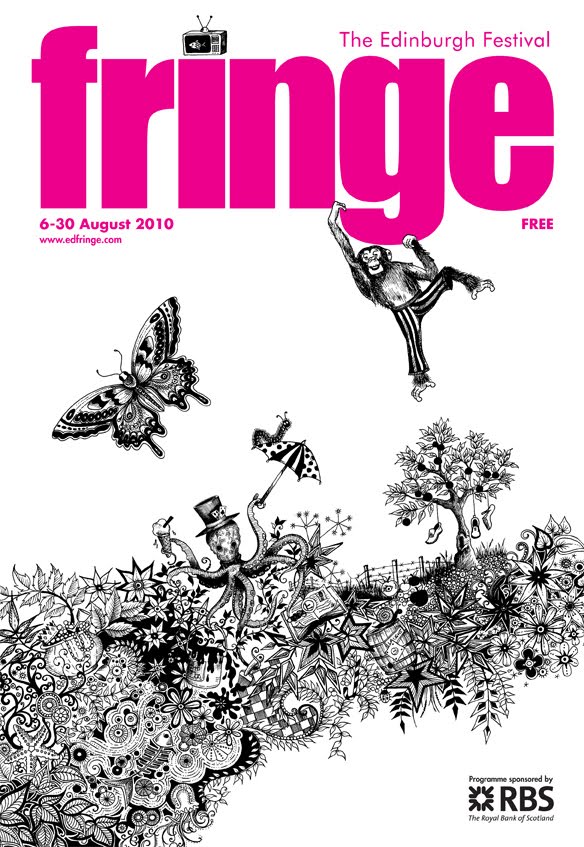

The type as image piece that she has then created using her equally detailed illustrations, is beautiful. From a distance, it is clearly readable and the closer you get, the more time you would spend looking at it because of all the imagery inside the lettering - in my opinion it works just aswell in terms of readability as the solid vector type.

No comments:
Post a Comment