‘Investigation of hand-crafted type and image’
Chapters/Categories:
Type and illustration for food/drink packaging.
- Examples of packaging.
- Materials.
- Printing processes.
- Colour selection.
- Historical/Past examples.
- Designers that do it well - Case studies.
- Quotes.
Children’s book cover illustration.
- Examples of contemporary children’s book covers.
- Well known illustrators/image makers - Case studies.
- History of children’s books.
- Tips i.e. Author as a brand.
- Brands/Brand guidelines.
- Print processes.
- Quotes
Black and white illustration.
- Why choose black and white illustration?
- What makes black and white illustration successful?
- Printing?
- Examples of work
- Appropriate contexts for it.
- Successful illustrators who do it - Case studies.
- Quotes.
Papercraft.
- What is papercraft?
- Techniques/How to?
- Examples of work.
- Appropriate contexts.
- Price restrictions.
- Mass production/printing processes.
- Materials.
- Successful papercraft designers - Case studies.
- Quotes.
Hand rendered type.
- What is hand rendered type?
- Examples of work.
- Appropriate contexts for hand rendered type.
- Top hand-rendered type designers - Case studies.
- Why choose hand-rendered type?
- Quotes.

Publication Formats
I had decided quite earlier on that I didn't really want to produce a basic book; this isn't because I think there is anything wrong with it, I just wanted something a little more interactive to reflect my design practice. This led me on to thinking about what format's could be appropriate for the context brief...
The work below by Shrigley, Hunter, King and Electric Angel are pieces that I have referenced in a previous brief (from the second year) because although they are collections of postcards, I still think they work well as books as they could just be treated like loose pages; also Lizzie Hunter's piece is actually a book of postcards with perforated edges so they can be removed.
David Shrigley;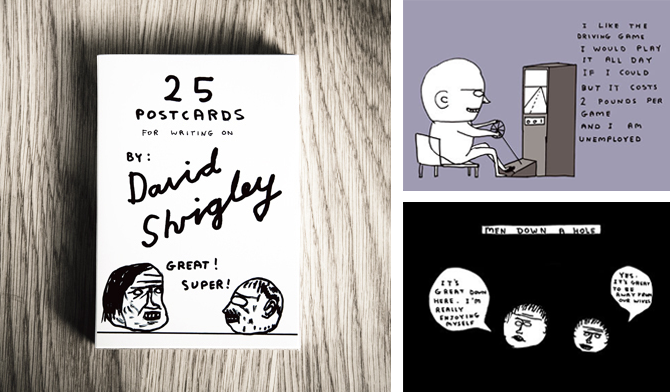

Lizzie Hunter;


Scott King;

Electric Angel;

This piece by Christopher Seeds is a nice example of how a long strip could work/read as a book but fold out into something more. If I was to produce something like this, I would be more likely to make it as a fold out poster.
Christopher Seeds;


A5 Magazine Portfolio;

Although the style of work on this Clare Ultimo piece doesn't exactly reflect my design practice, the format is interesting and something worth exploring - It is a way of including a lot of information but in different formats and scales, all kept in one package.
Clare Ultimo (Broadway Interactive Kit);
This book collection below (not sure who its designed by) is an interesting examples of how, what seem to look like quite basic books, can be interactive and sophisticated with pull out tabs and loose leafs to take out etc. and then how they can be packaged together.

Jordan Metcalf
In the process of looking for specifically black and white illustrations, I found this piece by Jordan Metcalf.
Metcalf preferred his b/w version but the t-shirt company he produced it for wanted him to add colour to it.
I think it works perfectly well just as a b/w illustration but I can see why colour may be needed for it to work on a t-shirt - to make it stand out more.

Metcalf preferred his b/w version but the t-shirt company he produced it for wanted him to add colour to it.
I think it works perfectly well just as a b/w illustration but I can see why colour may be needed for it to work on a t-shirt - to make it stand out more.

T M Addison
I love these typographic pieces by Addison.
The first one, 'I gots a lotta hair' is great because its so simple, its clearly based around Cooper Std (or something unbelievable similar) but by adding the finely detailed 'hairs' to it, it gives a flat illustration texture - it makes it look like it Should feel fluffy/hairy.

This 'sick' piece doesn't appear to be based on an existing typeface, therefore a lot more hand crafted. The highlighted areas to show the flow of the lettering works really well and really like the end resuly.

Nikita Milukovs
These detailed, fine illustrations by Milukovs are beautiful.
Although I like the illustrations as a whole, the main aspect of them that I like are the intricate patterns used to create textures on the various objects that have been drawn, for example the first image below: the bird, instead of drawing tiny little feathers, its a collection of line patterns which works just as well and gives it a more personal style.


Although I like the illustrations as a whole, the main aspect of them that I like are the intricate patterns used to create textures on the various objects that have been drawn, for example the first image below: the bird, instead of drawing tiny little feathers, its a collection of line patterns which works just as well and gives it a more personal style.


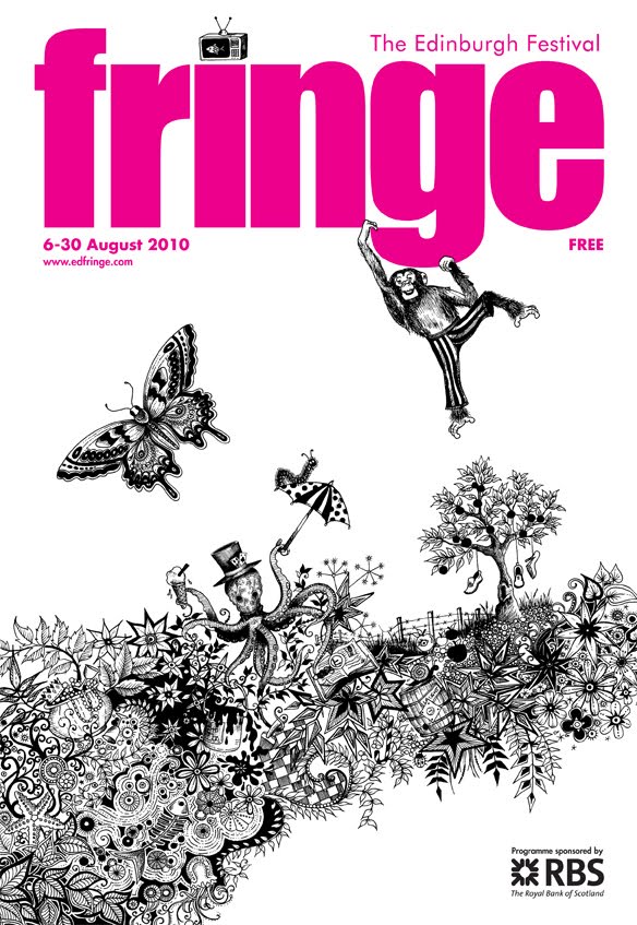
Johanna Basford
I have been aware of these illustrations for some time, as I saw them at the Edinburgh fringe last year but I didn't know who had done it and I came across it again on behance.
On the first 2 images below, the composition is particularly interesting and it allows the illustration to work across a variety of scales and formats. In my opinion, I think adding colour to the actual illustration would somewhat ruin it - the fine detail is enough to catch the eye.


On the first 2 images below, the composition is particularly interesting and it allows the illustration to work across a variety of scales and formats. In my opinion, I think adding colour to the actual illustration would somewhat ruin it - the fine detail is enough to catch the eye.

The type as image piece that she has then created using her equally detailed illustrations, is beautiful. From a distance, it is clearly readable and the closer you get, the more time you would spend looking at it because of all the imagery inside the lettering - in my opinion it works just aswell in terms of readability as the solid vector type.

Jeff Finley
Branding/Logo's isn't something I really focus on, but when I came across these black and white band logo's by Jeff Finley, I was instantly drawn to them...but in fairness, they are mainly type as image based.
The fact that the designer has designed them in black and white, in my opinion means they have more longevity because, although they all work as 1 colour designs, they can always be changed by simply adding colour or using different print techniques/finishes depending on the context i.e. t-shirts.


The fact that the designer has designed them in black and white, in my opinion means they have more longevity because, although they all work as 1 colour designs, they can always be changed by simply adding colour or using different print techniques/finishes depending on the context i.e. t-shirts.


Iain Macarthur
Everytime I looked at a new image produced by Iain Macarthur it shocked me even more - by taking things like birds, bears and skulls that are drawn quite a lot and adding his own textures that actually remind me a little bit of japanese tattoos.
The patterns that he uses to create textures on the animals/objects make them much more visually engaging.
They are a perfect example of how beautiful black and white imagery can be - if these had colour, it would risk overpowering the fine details and it really doesn't need any colour to attract any attention.


Diogo Machado
Although I like these illustrations by Machado, they don't have a particularly strong link to my design practice however, it is the line quality that I take more inspiration from here.
By using different line weights, it highlights different things and gives it a tonal value.


By using different line weights, it highlights different things and gives it a tonal value.


Andreas Preis
I absolutely love these images by Andreas Preis. I like working with lines anyway, but it is interesting to see how Preis has used the lines to create different shades - from a distance it looks like he has different shades of grey, but when you look closely, it appears that the different tone are created by the lines and how the thick the lines are and how spaced apart they are i.e. if they are very close, from a distance, it looks almost black and if they are quite spaced out they look like a light grey. Its a great idea of how using one colour, you can still create different tones.


Subscribe to:
Posts (Atom)