James and the Giant peach - Drawn up ideas

Leading on from the initial sketches that I did previously for James and the Giant peach - I drew up the 4 ideas that I felt worked best. From these I can scan them in and work with colour and type for the blurb.


The next big thing(S)

As mentioned previously, The idea behind the hand-drawn S at the end of 'The next big thing' is that, 'The next big thing' is quite a well known phrase meaning 'the new rage; the latest fad or trend, esp. in a particular field' but it only relates to a singular thing so by adding the S at the end it makes the things plural to talk about a group. It is then hand drawn to signify that the 'things' are creative people...artists, illustrators etc. who like to draw.

I chose to produce S's in different media i.e. pen, pencil, paint to see which worked best.


EOYS Initial mock ups

Leading on from the initial ideas that I had, I started to mock up posters.
It actually made a nice change that I usually Start producing work on the mac, so it was nice to see ideas taking shape so quickly.

The ideas below are just black and white - I will focus on colour when I have decided on what to develop.


At this moment in time, 'The next big things' is what I am developing - however, as there is a crit soon somebody my raise a point that I didn't realise and it will have to change...but at the moment, it is my preferred option. I have added the hand drawn 's' to the end and as an inital stage, I think it works quite well.


NYC Type play...

I drew up some initial hand rendered type ideas and played around with them - I like the idea of using photography incorporated with the type and overall, I don't really like the incorporation of the rainbow flag with the type - it looks quite messy.

None of the type is of a standard high enough to be used in my work but as experimentation it worked ok.


EOYS Initial tagline/poster ideas

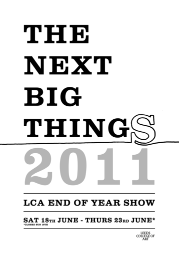
When reassessing the briefs that I was doing, I realised I was focusing on self initiated projects (i.e. New York and Oscar films) when the deadline for competition briefs is nearing, therefore I started on the End of year show promo ideas. I wanted to focus on a tagline that attracts attention - like last years 'Fresh out of the box'.
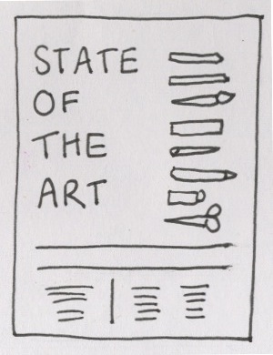
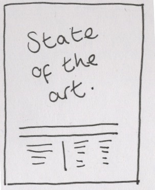
'State of the art'


The idea behind this phrase is that the phrase 'state of the art' is defined as meaning 'the most recent and therefore considered the best; up-to-the-minute' which I think is relevant and promotes it as a positive event, however - it is generally used in reference to technology/science so the illustration would need to communicate the 'art' side.

'To be continued'


The idea behind this was that the work/talent seen at the show will continue once we have graduated. I do like this idea but I think it might work better as part of another, overarching idea - i.e. put the quote above the doors where you leave the building to show it doesn't stop there.

'This is only the beginning' - 'This is not the end'

I didn't think much to these ideas and I recognise the 'This is only the beginning' so I think it might have been used before? Also, I kind of have the same issue with the 'This is not the end' idea as I did with the 'To be continued' one - it may work better with something else.

'The next big things'

In my opinion this works quite well, in a similar way to the 'state of the art' line, as its defined as 'the new rage; the latest fad or trend, esp. in a particular field'.
However, the well known phrase is just 'The next big thing' - so my idea is to used computer generated type for 'The next big thing' and add a hand-drawn 'S' at the end, to make it the next big thingS as its talking about a group.
The idea of using computer type with hand-drawn images/type could then work across signage etc.

Seagull type

As part of the story from James and the Giant peach is that the peach gets carried away by 500 seagulls, one of my inital ideas was to make the type out seagull images (the photos would be reference for an illustration)...Initally I felt positive about it but the more seagulls that I added I wasn't really sure about it. I think I will move on from this idea as it would be time consuming and may not be the most successful idea!


When I research 'feather type' for my oscar brief/black swan work, I came across this work of Chris Richer - which is type made out birds, titled 'words of a feather'. It looks better than the one I started working on and now that I know it already exists - it would just look like I was copying.

Chris Richer: