Daisy Lew

These pop up pieces by Daisy Lew are really effective and specifically relevant to my New York brief.
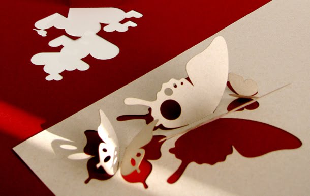
Lew produced a series of them that look like New York incons from above and then look like a skyline from a different angle - really quite ingenious.
I'm not sure if this particular idea is something I will develop of experiment with but it shows how detailed a pop up can be and, in this instance, look like so many buildings...and then from a different angle, look like 1 piece is excellent.


Publique living

These pieces by Publique living range from pop up mats to pop up cards - I assume its using quite a solid, strong stock in order to keep the shape and stay stood up.

The simple shapes and lack of colour actually give this a high level of sophistication rather than making them look boring - I can't imagine they would work as much if the shapes were coloured in.


Serial Cut

The examples of work below probably aren't what Serial Cut are best known for, however in terms of my design practice these are most appropriate at the moment.

The first one is relatively simple, the scale and composition are what work for it but it does look quite lo-fi. In contrast with this, the piece at the bottom looks quite complex and once again, is particularly relevant because of the incorporation of a skyline and other objects. I don't know if its a pop up...but as a 3D, static construction it works really well.


Owen Gildersleeve

This first piece by Owen Gildersleeve shows how popular pop up is at the moment - I think with the digital age that we live in, there is definately something appealing about hand crafted work and its probably becoming more popular because it is seen less and less.


I really like the piece below as it combines photography with hand crafted type/shapes and it works really well.


The range of typefaces used on the piece below...and the fact that it looks hand crafted/cut out by hand, give a great tangible appeal.

I really liked the one below mainly because of the limited colour pallette and the use of a skyline silhouette to set the scene.

'Ian and alison' (from six for gold blog)

I think this piece of work below is actually student work; I found it on a blog (Six for gold) and it just says that its by Ian and Alison for 'a well known travel company'.

As I intend to experiment with pop up work, this example is particularly appropriate as it includes landmarks of places - and I will be using it for my New York brief.

The limited colour pallette and strong vectorised images are something that I don't intend to use although it does look good, but the 'oversized pop up' idea is something I will look into.


Thomas Allen

The intention of Allen's work is to 'set the scene' - therefore a lot of his work actually includes the books.
I don't have a specific brief that involves me illustration or communicating the scenes of a book but the crafting, composition, scale and style of pop up is something I can take inspiration from.


Interative posters

Something that I am interested in is audience interaction with relatively simple products such as posters - to see what the possibilities are rather than just having a flat poster that can only be looked at.

The piece by Dovier below is still soemthing to be looked at but it is only readable when you stand in one position, kind of like an optical illusion, so the audience have to visually interact with it to make it work.

Mattis Dovier


The 'pixel it' poster by Nebel is a great example of how you can interact with what looks like a flat piece of paper and actually customise the poster to suit what the audience wants.

Jessica Nebel


Chrissie Macdonald

The crafting of Macdonald's work is...outstanding. Honestly, I'm not sure that I could realistically produce something this high quality but I'd like to try.
Its not just the crafting of Macdonald's work that make it so successful its the photography - the lighting and composition are particularly strong points about the work, which show how important that factor is too - i.e. I could make something really well crafted but if it isn't photographed well, it could look awful.


Hattie Newman

The first piece of Hattie Newman's work that I came across was the hand crafted Britain type for the Guardian. Its a really effective example of how a relatively simple typeface can be brought to life and edited to communicate a message - this is definately something I'd like to experiment with in the future.

All the other pieces shown below are further examples of how successful hand crafting can be. Specifically the bottom piece of the trees and fire - it is extremely simple but it works, it doesn't need any more details to communicate what it is.


Jen Stark

Stark is well known for her hand crafted paper sculptures...which are amazing.
I don't intend to produce pieces just like this because they have a more fine art feel to it (in my opinion). However, they're great examples of what it possible by just cutting paper.
The combination of colours also work really well.