I went to the Crit feeling rather disheartened with most of my work - I've definately taken far too long with the briefs which has resulted in me being bored of looking at them but I hoped the crit with refresh my mind and give me some 'drive' to carry on.
Crit questions
Puffin brief -
Note: The printed examples that are shown at the crit haven't printed as well as i'd hoped i.e. the red's have come out pink, but the correct colours can be seen on the digital versions here
1. In your opinion do the 5 book covers work as a set?
2. Do the colours work? - if you would change any, what would they be?
3. Does the idea of a range need expanding? - I will be producing a box for them to go in, can you suggest any other items that could be added to the range? i.e. Bookmarks
NYC Pride -
1. Do you think it works having hand-drawn pieces with the photographs?
2. I have the range planned which you can see here . Are there any other suggestions for the range?
3. Do you prefer the pop up idea or just papercrafted photography?
Oscar brief -
This brief is at a very early stage and it is 'imaginary' as all the films have been released. The range idea can be seen here (3. Special screenings at mainstream cinema)
1. I haven't yet added colour to any of the pieces - without seeing any mock ups would you imagine that flat colour would work better than textured? Or vice versa.
2. Toy Story 3 poster - at this moment in time, I have about 9 different poster mock ups with different 'iconic' character pieces i.e. Woody's hat - would you suggest keeping the 9 different ones OR choosing one iconic piece, again like Woody's hat?
NYC sketches
Having gathered the imagery to go in my new york piece, I needed to work more with the type and possible layouts - the layouts below are intended to show how I could organise the seperate pieces to then be photographed.
Labels:
Brief 1 - NYC Pride,
OUGD303DP
Final Covers
These are the final covers (at this stage) that I will printing off - I'm really happy with them and in my opinion, they work well as a set. Hopefully they will keep their quality once printed.
If any issues arise at the crit, I have plenty of time to make alterations.
The next step in this brief is to make the packaging, so that they look like a boxset. I may also do bookmarks to go with each book.
Matilda
George's Marvellous Medicine
From the initial drawing stage this was the one I was most looking forward to drawing and I'm really happy with how it turned out.


When it came to adding colour, I thought it was important to take note of what colour George's 'marvellous medicine' was in the book - in a slight unfortunate turn, it turned out it was brown which isn't a particularly 'nice' colour but by adding the turquoise/blue I am happy with the end result.
When it came to the type, I wasn't sure whether I wanted it to be whole letter or a bubble with the letters cut out - so I tried both.
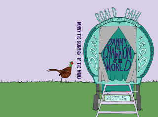
Danny, The Champion of the World
This story was probably the most 'different' out of the collection that I chose, but I was still confident in pursuing it. I chose to highlight the Gypsy vardo/caravan which is where he lives in the story - by adding the pheasant on the back page it hints at another part of the story.


Initially, I was worried that it wouldn't fit with the other books just because of the story being quite 'different' but as its produced in the same 'style' I think it will fit with the others.
Charlie and the Chocolate Factory
Evidently, this is somewhat inspired more by the modern film rather than the original version (Willy wonka's straight hair etc.) and I think this is relevant to a contemporary audience as the children are more likely to identify with that film rather than the original with Gene Wilder.

 When I first started adding colour, I was happy with this one and left it there - but after going back to it, I realised the background was maybe a little dark (and probably wouldn't print out that vibrant!) and the actual title of the book gets a little lost in the background - hence why I eventually replaced the black outline with white.

 When I first started adding colour, I was happy with this one and left it there - but after going back to it, I realised the background was maybe a little dark (and probably wouldn't print out that vibrant!) and the actual title of the book gets a little lost in the background - hence why I eventually replaced the black outline with white.
Statue of liberty
As I needed to alter the Statue of Liberty anyway (add the black outline to make it fit with the other drawings) - I decided to make it even more fitting with the theme (and somewhat over the top maybe?) of Gay Pride by replacing the torch with a Rainbow flag.
I'm really happy with how it turned out - and although I liked the original coloured version with no black outline, I think this fits a lot better and the flag adds a humorous side too it - as the skyscrapers have the rainbow flag colours in the drawing (i.e. the windows) it means the Statue also has her own 'twist'.
Labels:
Brief 1 - NYC Pride,
OUGD303DP
Initial book cover drawings
Below are the final drawn up pencil versions of the Puffin book covers - at this stage I'm happy with them and I hope they develop well.
Subscribe to:
Posts (Atom)


