More pop up experiments

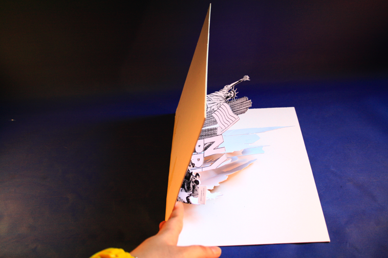
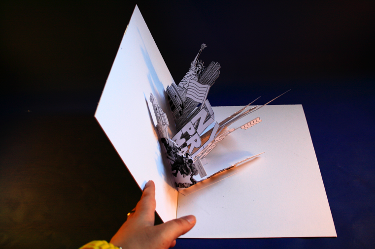
These are some slightly more developed 'pop-up-mock-ups'. Although I have enjoyed constructing fold out pop-up pieces, I'm not sure it would be viable as a promotional piece for a free event as it would be quite costly but I would like to produce a more 'complete' one - in colour etc.

This style of pop up works well as once it is opened, it is still a relatively flat image - just on different layers, which makes it easier to see everything as a whole.


I posted some images of the pop up before and initially I felt it worked quite well, but since producing a pop up using a different method, its clear that this doesn't look quite as good - the fact that the pieces have to be so angled makes it looks quite messy once opened, although I do like the composition of the skyscrapers in the background.


I then went on to tryout stand alone pieces - quite a popular papercraft technique at the moment. I was working with basic laser printer paper, so it wasn't the strongest stock but as a trial it worked fine. I am going to pursue this idea aswell, with the coloured pieces etc. and see how I can incorporate text - i.e. cut out pieces or drawn on afterwards.

Obviously, if I want to pursue this idea, photography needs to be a lot better but this was simply a means of documenting experiments.


NYC Pride photos

I posted some NYC Pride photos a while back, but these are the ones I am currently working with, that have been cut away from their background so I can use them digitally and they'll be easier to physically cut out.
If needs be, I have many more images but these were a selection that I thought captured the atmosphere quite well.

Lady Gaga 'Drawn this way'

While I was browsing my beloved celebrity gossip websites, I came across an article that was mainly about the fact Lady Gaga has been announced as a fashion columnist for V Magazine, an American fashion magazine, but at the bottom it mentioned the magazine were holding a competition to illustrate an image of Lady Gaga to go alongside the column (the reason why is explained on the written out brief).

The competition was only announced on 29th March and the deadline was 3rd April.
I found out about it on 31st and treat it as a very short, half day brief.


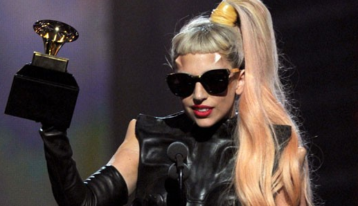
I decided to base the illustration on one of her most recent looks, with the horn type things on her head (more specifically, her look at this years grammy's).


On the competition e-flyer it suggested that she should be styled as an 'editrix' so I was thinking of how to do that and I simply put her in front of a laptop - I toyed with the idea of pen and paper but that may be a little 'old school' for her, however I still put a pencil on the image, on her ear so it still has a reference to a stereotypical view of a newspaper columnist/author.


I always find it difficult when I have a white background and aren't sure what to do with it, so in this instance I used an 'in your face', highly saturated pink to reflect the fact that Lady Gaga is generally in your face - but then I didn't really like it, so I went for a less 'in your face' one, lots of thin lines so that from a distance it looks like a pale grey.


Drawn this way brief

Design Context group surgery follow up


When I was preparing work for the context surgery, I was aware that I had a lot/too much planned and that's why I needed the help of the workshop.

It quickly became apparent that:
1) The chapters I had needed a thread to highlight the relationship between them all.
2) I need to keep it more simple/focused.

- The issue with the chapters looking a little unrelated is definately something I was aware of but I wasn't sure how to overcome it, the chapters were:
  1. Type and illustration for food/drink packaging
  2. Children's book cover illustration
  3. Black and white illustration
  4. Papercraft
  5. Hand crafted type
The issues were:
  1. Why specifically food/drink packaging?
  2. -
  3. Why black and white? And is it substantial enough for a chapter?
  4. Could papercraft just be related to packaging?
  5. This could be linked in with other chapters.
Also, I had specified that I would look at pricing and manufacturing techniques for mass production of papercraft etc. but it was highlighted that if i'm not interested in that - I don't have to include it - which was a relief!

After some discussion, it was suggested that I could title it 'Hand-crafted' and have 2 sections Type and Image, as then I could include all that I wanted an more because it could have hand crafted type, colour and black and white and its applications i.e. packaging, book covers etc. and the same for image.

Some of the other things I noted down that was general advice:
- Don't just regurgatate what you've found; how can it Not just be a collection of images.
- What are the markets for the work - Agencies/Companies that use them.
- If you're contacting designers to ask them questions, engineer it so that you get the response/information that you want as opposed to 'yes' or 'no' answers.
- On the blog - show things that don't work as well as things that do work, so that it sets a benchmark and backs up your opinions on what Does work.
- Get a good title!
- Can include your own work IF it fits - it shouldn't stand out.
- Teach the audience something - but make it accessible.

Also, one question that I got the oppurtunity to ask (but felt a little silly for asking) was;
What is the difference between hand-crafted and hand-rendered?
- Render - Formal
- Crafted - More informal, hands on.

So to conclude, I came out of the design context feeling positive and ready to get on with it!

Chapters/Categories

‘Investigation of hand-crafted type and image’

Chapters/Categories:

Type and illustration for food/drink packaging.
- Examples of packaging.
- Materials.
- Printing processes.
- Colour selection.
- Historical/Past examples.
- Designers that do it well - Case studies.
- Quotes.

Children’s book cover illustration.
- Examples of contemporary children’s book covers.
- Well known illustrators/image makers - Case studies.
- History of children’s books.
- Tips i.e. Author as a brand.
- Brands/Brand guidelines.
- Print processes.
- Quotes

Black and white illustration.
- Why choose black and white illustration?
- What makes black and white illustration successful?
- Printing?
- Examples of work
- Appropriate contexts for it.
- Successful illustrators who do it - Case studies.
- Quotes.

Papercraft.
- What is papercraft?
- Techniques/How to?
- Examples of work.
- Appropriate contexts.
- Price restrictions.
- Mass production/printing processes.
- Materials.
- Successful papercraft designers - Case studies.
- Quotes.

Hand rendered type.
- What is hand rendered type?
- Examples of work.
- Appropriate contexts for hand rendered type.
- Top hand-rendered type designers - Case studies.
- Why choose hand-rendered type?
- Quotes.

Publication Formats

I had decided quite earlier on that I didn't really want to produce a basic book; this isn't because I think there is anything wrong with it, I just wanted something a little more interactive to reflect my design practice. This led me on to thinking about what format's could be appropriate for the context brief...

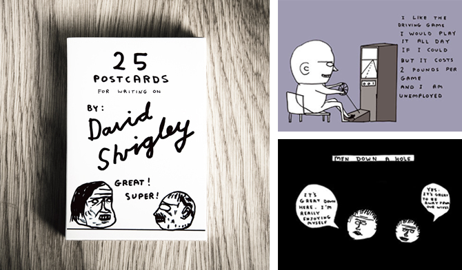
The work below by Shrigley, Hunter, King and Electric Angel are pieces that I have referenced in a previous brief (from the second year) because although they are collections of postcards, I still think they work well as books as they could just be treated like loose pages; also Lizzie Hunter's piece is actually a book of postcards with perforated edges so they can be removed.

David Shrigley;


Lizzie Hunter;


Scott King;


Electric Angel;


This piece by Christopher Seeds is a nice example of how a long strip could work/read as a book but fold out into something more. If I was to produce something like this, I would be more likely to make it as a fold out poster.

Christopher Seeds;


A5 Magazine Portfolio;


Although the style of work on this Clare Ultimo piece doesn't exactly reflect my design practice, the format is interesting and something worth exploring - It is a way of including a lot of information but in different formats and scales, all kept in one package.
Clare Ultimo (Broadway Interactive Kit);


This book collection below (not sure who its designed by) is an interesting examples of how, what seem to look like quite basic books, can be interactive and sophisticated with pull out tabs and loose leafs to take out etc. and then how they can be packaged together.


Jordan Metcalf

In the process of looking for specifically black and white illustrations, I found this piece by Jordan Metcalf.
Metcalf preferred his b/w version but the t-shirt company he produced it for wanted him to add colour to it.
I think it works perfectly well just as a b/w illustration but I can see why colour may be needed for it to work on a t-shirt - to make it stand out more.

T M Addison

I love these typographic pieces by Addison.
The first one, 'I gots a lotta hair' is great because its so simple, its clearly based around Cooper Std (or something unbelievable similar) but by adding the finely detailed 'hairs' to it, it gives a flat illustration texture - it makes it look like it Should feel fluffy/hairy.


This 'sick' piece doesn't appear to be based on an existing typeface, therefore a lot more hand crafted. The highlighted areas to show the flow of the lettering works really well and really like the end resuly.