At this stage of the last module...I don't think I'd really got anywhere, I was just changing my mind all the time and as a result of that - wasting my time. My statement of intent was relatively vague so brief writing was hard and I wasn't sure what I should have been getting out of the briefs.
Therefore, I knew that I needed to be more sure of myself when it came to this project surgery and thankfully I was. I had 5 briefs (3 quite substantial and 2 kind of short ones) and my statement of intent.
I had my tutorial today with Lorenzo and I was even more focused when I came out of it, which was beneficial!
Issues raised/discussed:
- My position statement was clear and simple enough, but after talking about paper crafting, it was decided I should add format to the end of it, therefore it is now:
'Driven by hand crafted type and image with an interest in packaging, print and format'
- My rationale was a bit 'rambley' - It could definately be simplified; just pick out the ket points.
- Key words from rationale should also go in the subjects/themes section, words such as; hand crafting, simple etc.
- Design context brief - I clearly haven't focused on this much but we clarified a potential title so that I can start working towards it and deciding on chapters. The title is:
'A hand crafted investigation of type and image' - from this I could still have chapters on packaging etc. and relate them to type and image on packaging.
- In terms of the briefs that I've written, I need to clarify the 'Concept/proposition' and 'Mandatory requirements section'. I was always at a loss when it came to these sections so I was happy that Lorenzo clarified them from me -
Concept/proposition - the problem.
Mandatory requirements - the answers.
- If I want to do the D&AD body shop brief...but don't want to feel restricted by the body shop mandatories, I could change it to produce packaging for a more youthful competitor.
- The lyrics and type brief is ok, but it needs more of a 'reason' behind it. I put 'prints for a fictional gallery' but it potentially be something like - 'images to be used alongside the artist when they perform at ?? festival'...
- I need another lengthier brief and a collaborative one.
All in all, it was quite a short project surgery but I got a lot out of it.
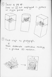
NYC Pride (2010)
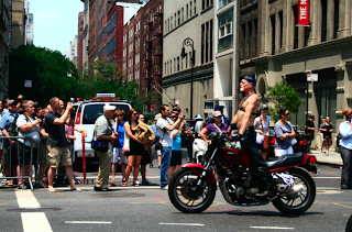
I was lucky enough to go New York last year and the City Pride festival happened to be taking place while I was there - I took a ridiculous amount of photos so I thought it was the perfect excuse to write this brief and make use of my own photography.
Below are a few images I have chosen to work with in terms of experimentation - As I will be cutting them and playing around them, I needed to just iscolate the part of the photo I want to work with.
Below are a few images I have chosen to work with in terms of experimentation - As I will be cutting them and playing around them, I needed to just iscolate the part of the photo I want to work with.
Labels:
Brief 1 - NYC Pride,
OUGD303DP
Sagmeister
These pieces by Sagmeister are a similar inspiration to the work of D Billy by putting the words into a real environment but, in my opinion, this is of a much higher quality and the photography is a little better.
I'm not 100% sure as of yet where and which brief I will incorporate the idea of putting words in an environment, but the more examples of it I see the more I want to try it.


I'm not 100% sure as of yet where and which brief I will incorporate the idea of putting words in an environment, but the more examples of it I see the more I want to try it.


Labels:
OUGD303DC
Silja Goetz
Something I am interested in is the development of creative typefaces - not a typeface that could be used like Helvetica in large blocks of text but quite experimental typefaces that are still readable and could be used in publication or promotion for headlines/titles etc.
These examples below by Silja Goetz with the mixture of image would presumably be quite hard to read but the composition, scale and colour mean that it is relatively simple to read.


These examples below by Silja Goetz with the mixture of image would presumably be quite hard to read but the composition, scale and colour mean that it is relatively simple to read.


Labels:
OUGD303DC
Telegramme studio
This work by Telegramme is quite similar to vintage/retro type inspiration that I posted earlier.
I think this would be particularly relevant for the design direction I intend to pursue with the Ted Baker YCN brief.
Once again, its the range of typefaces and colour pallette that I really like about this work and will take inspiration from.


I think this would be particularly relevant for the design direction I intend to pursue with the Ted Baker YCN brief.
Once again, its the range of typefaces and colour pallette that I really like about this work and will take inspiration from.


Labels:
OUGD303DC
Like minded studio
Like minded studio's type is beautifully crafted and I really like the second piece that has actually been engraved onto wood.
A process that I do in a lot of my work is hand drawing something then making it digital - which is maybe similar to the work below as they are quite individual examples of typography.


A process that I do in a lot of my work is hand drawing something then making it digital - which is maybe similar to the work below as they are quite individual examples of typography.


Labels:
OUGD303DC
D.Billy
Type as image is a strong passion of mine that I intend to work with in my final major project.
I posted the work of Sean Freeman before, and this work by D.Billy is on a similar level - visually communicating a word in quite a literal way.
This work really is quite lo-fi and when it comes to type I want to produce more high quality work but putting words in the environment is something I like.


Labels:
OUGD303DC
Mary Kilvert
It became apparent in a recent portfolio surgery with Mark Howe that something consistant throughout my work is line quality and quite a 'lo-fi' style of work.
One of the briefs I will be working on is a book cover design for the Puffin childrens book award.
I think the work of Mary Kilvert and these book covers in particular will be a strong contextual link within this brief. Also the use of block colours is something I will experiment with but the line quality and hand drawn appeal is definately something that I will be incorporating.
Labels:
OUGD303DC
Colette Fu
Out of all pop up examples I have found - at such an early stage in my New York brief, Colette Fu's work is most relevant, as much of it actually documents an event and I intend to look into documenting a New York event (Gay Pride festival)
It is mainly a combination of photographs whereas I want to work with a mixture of photography and drawing. Other than that, this work will definately be inspiration in my development.
It is mainly a combination of photographs whereas I want to work with a mixture of photography and drawing. Other than that, this work will definately be inspiration in my development.
Labels:
OUGD303DC
Subscribe to:
Comments (Atom)


